VNDLSM — Brand & commerce platform
VNDLSM · Work 01 — Est. 2023representing art.
An art-forward clothing label built on graphic expression, statement-led design, and everyday rebellion.
KAIHO shaped VNDLSM into a system that could hold both chaos and commerce — raw graphics, a mascot-led identity, product storytelling, social content, and a clean online store. A brand expressive enough to be remembered, structured enough to be sold.
Designed, built, shipped.
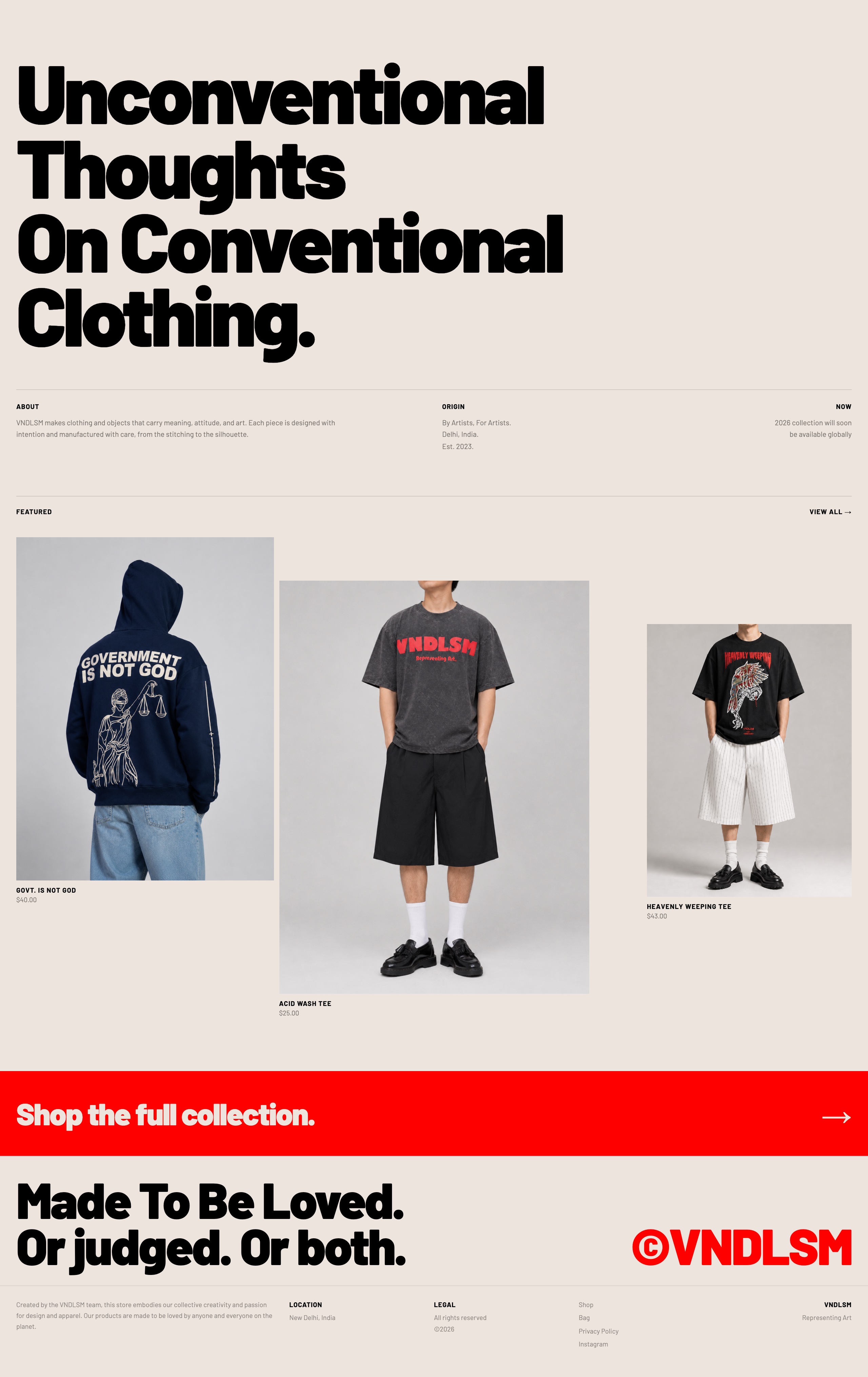
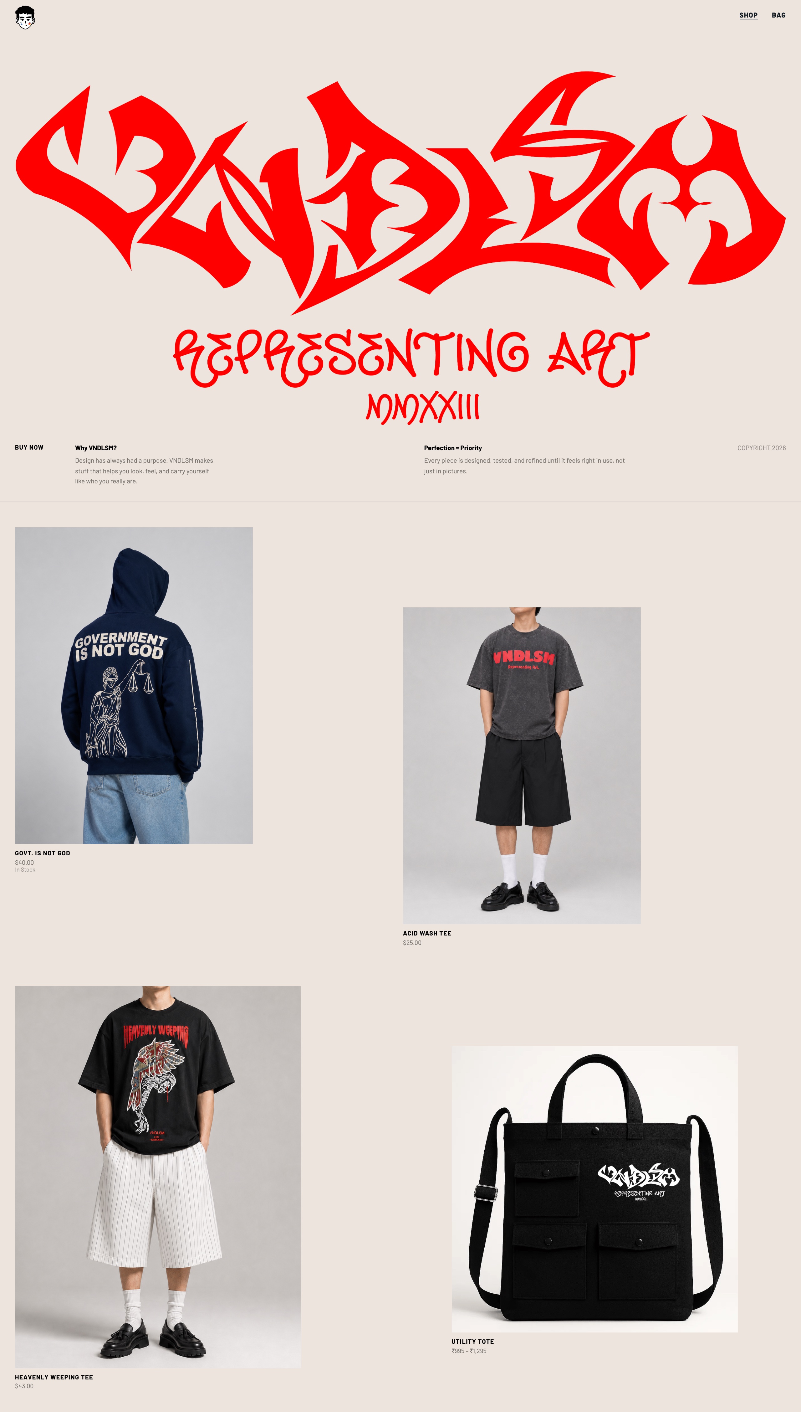
Hover a screen to scroll the page.
It didn’t need to look more polished. It needed to become more understandable.
The brand already had attitude, artwork, and a point of view. The work was turning that energy into a system that could run across clothing, content, product pages, and commerce — without losing its raw character.
Representing art.
VNDLSM is built on the belief that clothing can carry more than style — opinions, symbols, jokes, discomfort, memory, identity. The graphics work as visual interruptions: not decoration, not trend-chasing. Statements. Art on the street that still functions like a product-led commerce brand.
Three core ideas.
Art as identity
The graphics are the voice of the brand. Every product has to feel like it says something.
Everyday rebellion
The clothes are wearable, but the attitude is disruptive — made for people who want their clothing to carry a point of view.
Raw outside, structured inside
Loud, handmade, imperfect on the surface — clean, usable, and consistent underneath.
Contrast is the language.
A graffiti-inspired wordmark brings aggression and movement. The face mascot gives the brand a recognisable character. The “representing art” line anchors it in a clear belief — a world that feels expressive, youthful, and slightly confrontational. Not a logo placed on clothes; a visual language built around expression.
- Product graphics
- Garment prints
- Website headers
- Product cards
- Social content
- Campaign visuals
- Packaging & labels
- Drop announcements
A face people can remember.
The VNDLSM face is a brand character, not just an icon. The painted cheeks, flat expression, and illustrated form make it playful, strange, and recognisable without explaining itself. It runs as a primary mark, a product graphic, a sticker, a website detail, a social avatar, and a recurring campaign element.
Built to be owned, not safe.
Bold type, illustrated references, oversized back prints, and raw placement — products treated like wearable posters, made to be seen from a distance.
Every product is a canvas.
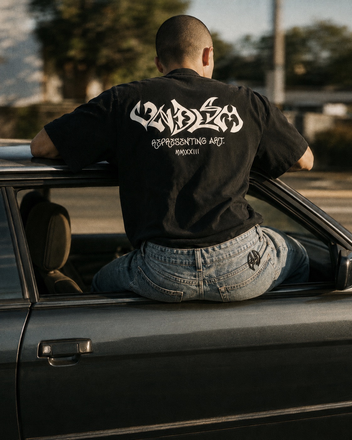
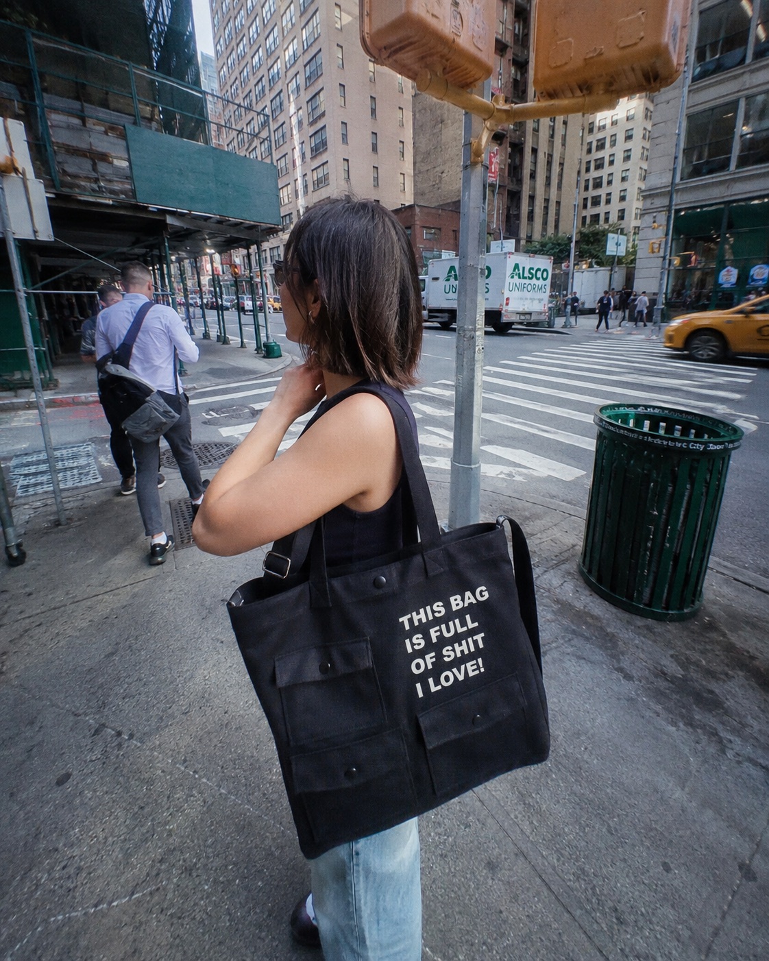
Hoodie
The back becomes the main storytelling surface — a walking poster.
T-shirt
A cleaner, wearable chest hit for daily rotation.
Tote
Extends the brand into an everyday object you actually use.
Raw attitude. Clean checkout.
The store had to do two jobs at once — carry the attitude of the brand, and make the product easy to understand and buy. Clean layouts, strong product cards, cover-and-hover imagery, and a mobile-first structure.
Content swings between clean e-commerce clarity and raw brand attitude — studio product shots and red-background campaign frames built to feel like one world.
The full system.
- Brand positioning
- Identity direction
- Logo & mascot system
- Graphic language
- Product presentation system
- Content direction
- E-commerce direction
- Product page structure
- Social content direction
- Launch-ready visual system
Not just clothes with graphics. A brand built to be worn, recognised, and remembered.
VNDLSM now has a clearer visual world, a stronger product language, and a system that scales across drops, campaigns, social, and online sales — connecting identity, product, content, and commerce.
Raw art direction turned into a structured brand and commerce system.